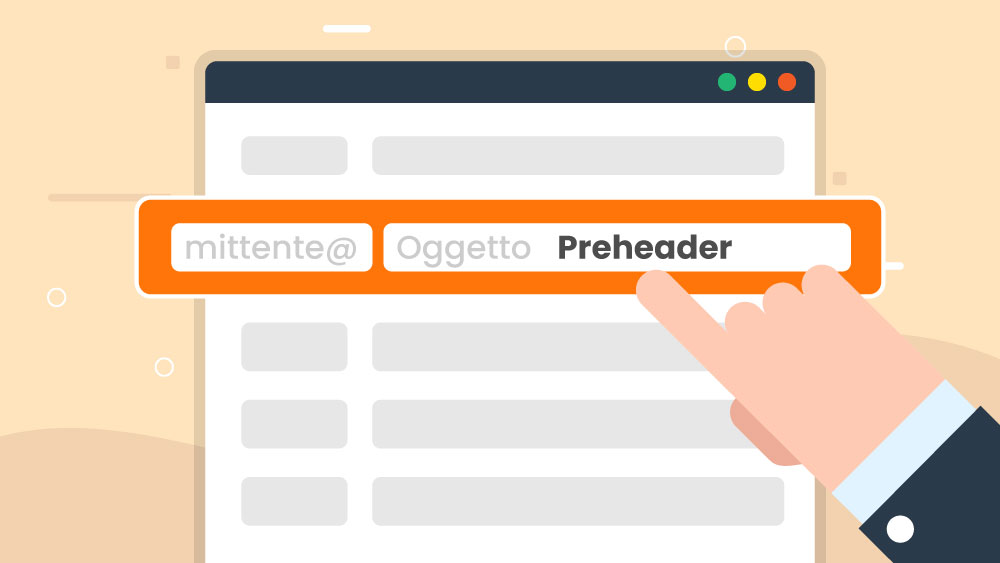
Is your mailbox bursting again? It happens to everyone. A few simple but effective tricks will help you to stand out and convince subscribers to open your emails. One of these tricks is to write the preheader.
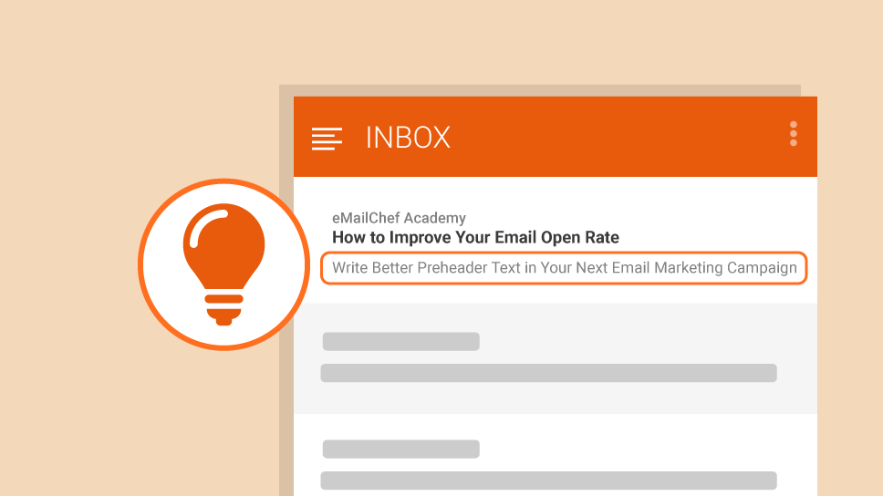
Together with the sender and the email subject, the pre-header is the short text that appears in the preview of an email message. It’s one of the three key elements that, if written carefully, can boost your opening rates significantly.
When viewing the mailbox on a mobile device, this line of text is even more relevant than the subject because it stands out so clearly. We have prepared a simple guide to the preheader and how it works.
Sending newsletters without writing the preheader is one of the five most serious mistakes that anyone who uses email marketing can make.
Fortunately, all the best email marketing platforms now allow you to customize the preheader. In this post, we’ll give you some tips to write the perfect preheader for your newsletter. Adapt these tips to your style and message content and improve the results of your campaigns.
Add Information Related to the Email’s Subject
A newspaper headline captures the reader’s attention by communicating a simple message: it tells people that something has happened. The subtitle or lede provides just enough detail to make them read on.
The relationship between the subject of the email and the preheader is like the relationship between the headline and the subtitle or lede. They are two distinct sentences, but together they connect information that someone will find interesting. A newspaper reader will open the newspaper. A newsletter subscriber will open the email.
Setting the subject and preheader to provide a continuity of information flow enhances both elements and provides a preview of the newsletter.
Enter the Recipient’s Name (and Add a Call to Action!)
The best email marketing services like Emailchef let you insert placeholders in the email text. These are variables that add information about each contact from the database. Use the “Name” variable, for example, and the recipient will see their name in the space occupied by the placeholder.
The placeholder can be followed by a call to action, expressed clearly and briefly. Here is an example:
Subject: Monday is Father’s Day
Preheader: Michael, discover our offers and make your dad smile.
Note that you can’t know how many characters of the preheader the recipient will see. That depends not only on the user’s email client, but also on their device.
This article can give you some more information but, in general, write about 100 characters, putting the core of the message in the first 35 characters. That will guarantee that even smaller tablets and smartphones will display the most important part of the preheader.
Experiment with Emojis and Add a Promotion
Emojis are now a vital part of people’s communications. Used carefully, including them in the email preheader can add a touch of “humanity” to the message. For example, you could test this emoji ? in a preheader like this:
Subject: Happy holidays from Zara
Preheader: Summer sales continue ? for the whole spring-summer collection. Further reductions in sight.
Preheaders like these induce a sense of urgency while the communicative power of an emoji is far superior to the single space it occupies within the text. Emojis stand out from the rest of the text in the mailbox.
Now it’s your turn! Test these tips. Mix them each up. Refine them so that they match your communication style, and use them as bases to develop new preheader templates. You will soon find the best kinds of preheader to persuade your contacts to open your newsletters.
If, after watching this video, you’re wonder about MailStyler, it’s nothing more than the powerful newsletter editor integrated into Emailchef Cloud!

