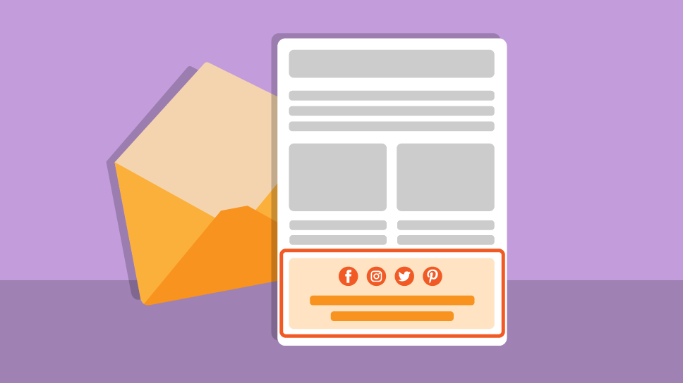
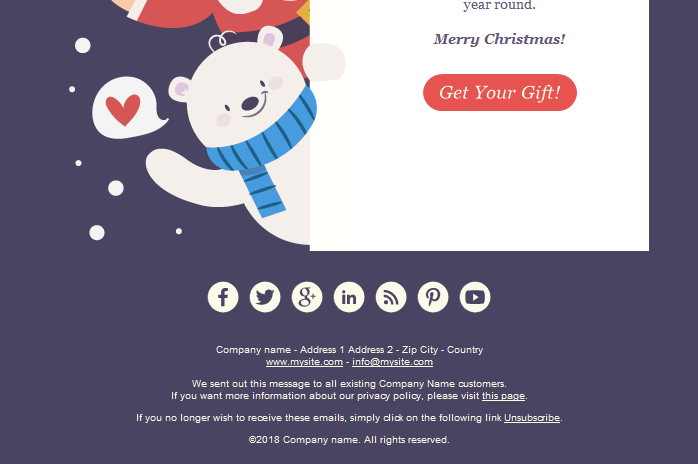
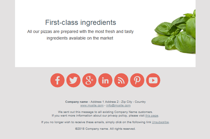
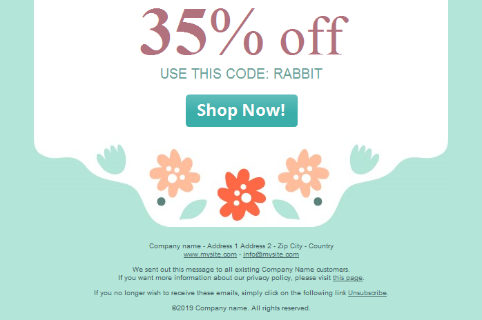
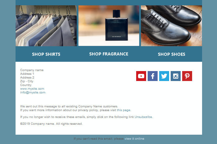
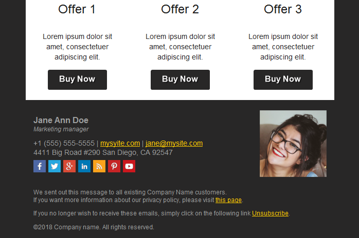
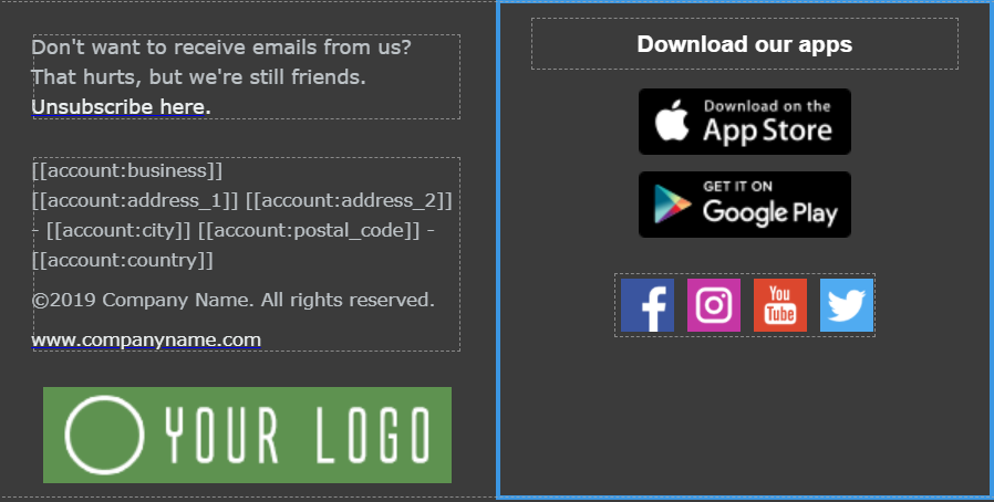
What is the footer of a newsletter? The footer is the lower section of an email. It’s distinguished from the rest of the message and contains some very specific content.
The newsletter footer is an important part of building an aura of “respectability” that the recipient feels about a sender. It must be consistent with the design of the email and be beautiful to look at.
A carefully crafted footer must include a whole series of elements. Follow our advice and you won’t go wrong.
The Unsubscribe Link
Every newsletter must include a clear and unambiguous link to unsubscribe. Normally that link is placed in the footer. Within the Emailchef editor our developers have crafted the “CAN-Spam Act” block, which contains not only the “unsubscribe” link, but also general company information. If you’re content with the minimum, just drag it into the canvas and you’re done!
Link to the Preference Center
If you send more than one type of newsletter, you can also add a second link next to the unsubscribe option. This is the email preference center, usually written with a sentence like “Update your preferences”.
The idea, which can be explained with a line of text under the link, is that the user can change the type and number of emails they receive from the brand without unsubscribing from all of them.
Permission Reminder
It’s a good idea to remind your users why they receive your newsletters. A line like “You receive this email because you subscribed to our mailing list” is useful for recipients who have subscribed to many mailing lists or are a bit… “distracted” when browsing emails. It also reduces the number of unsubscriptions.
Contact Information
The set of information included in the footer usually consists of an email address (checked by a real person), a physical address, and a link to the institutional website, or multiple links to specific pages like news, blogs, about us, personal area, etc.
It is not always possible for a recipient to reply directly to a newsletter. For this reason, the contact email address is important and may vary depending on the type of the message: info, shop window, reminder for the abandoned cart, and so on.
Privacy Policy
This can consist of no more than a link that redirects your recipients to the page explaining your policy towards protecting personal data.
Company Logo or Image
This is optional. But if you do include it, the format and colors of the image or logo must be consistent with the size of the footer and the background color, which is very often dark gray.
The idea of these visual elements is to reaffirm the authority of the sender and inspire the recipient. Use a beautiful image in line with your corporate identity and values.
Company Values
You can also use the footer to transmit your company values. Often a concise slogan can communicate the brand’s commitment to a range of topics, from environmental protection to a short supply chain or the respect of values cherished by the recipient.
Even a short paragraph, if carefully placed along the entire width of the footer, can become an element that your recipients read with interest as a strong “identity” statement of the brand’s beliefs.
-
Social Network Icons
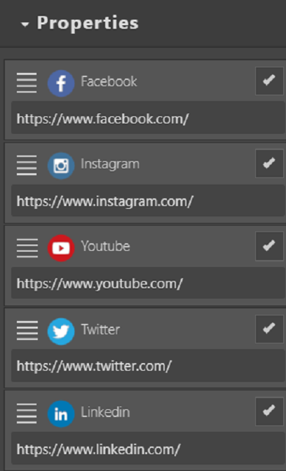
The Emailchef drag & drop editor allows you to easily insert in the footer all the components we have described, as well as social network icons. You can activate and deactivate with a tick all the icons you want to display in the footer.
You can also add calls to action to invite the user to download your app on Android and iOS devices.
After reading this post you will have understood the strategic importance of the footer and the need to use it. That’s really simple with Emailchef’s tools.
-
