
The first impression is the one that matters most. That’s why the use of colors in email marketing should never be left to chance.
The subject of the email and the preheader can convince the user to open the message, but it’s the quality of the newsletter design that stimulates the conversion, that click on the call to action.
In email marketing, as with any type of visual communication, choosing the right colors is key to strengthening the message you want to convey. Before you design your email, you need to provide the answers to these questions:
- What is the goal of the email?
- What is the standard palette you have chosen for the company’s coordinated image?
- Can demographic, geographic, or gender information help you to choose better colors?
- Is the email seasonal or festive or linked to an event with a default palette?
Planning the palette for your emails doesn’t mean picking a color and then making it work within the newsletter layout. Designers use different color schemes to compose the most appropriate colors for each situation.
The process begins with the choice of a basic color (usually the main color of the brand.) A second color is selected according to the first—and you might even want a third tone.
This post will help you to choose the right colors for your newsletters.
The Meaning of Colors
The choice of your newsletter template’s color palette should never be random or based only on personal taste. Several scientific studies have found that each color is able to inspire specific emotions and sensations in people who see it. That’s why brands have strict visual guidelines that include the use of colors.
So let’s try to analyze some of the main colors that are often considered when creating a newsletter.
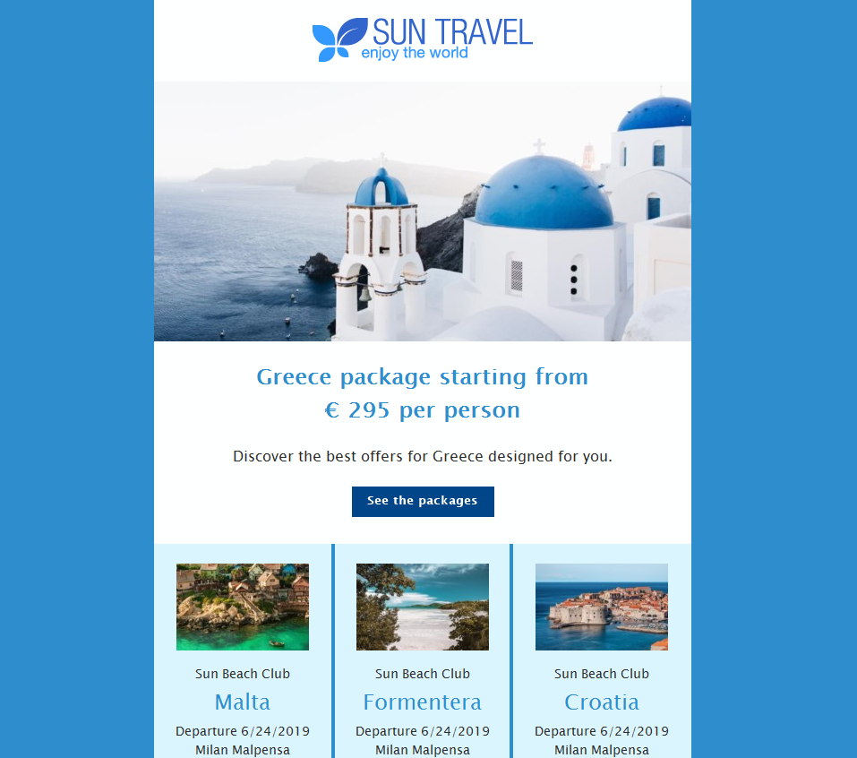
Blue
Blue communicates feelings of trust, safety, and reliability. It’s also associated with tranquility and well-being which is why it’s one of the most popular colors on social media and on institutional websites. Companies use it to strengthen the bond of trust with their customers.
Blue and its variations in a monochromatic color scheme can give a newsletter a general soothing effect. The font is usually white.
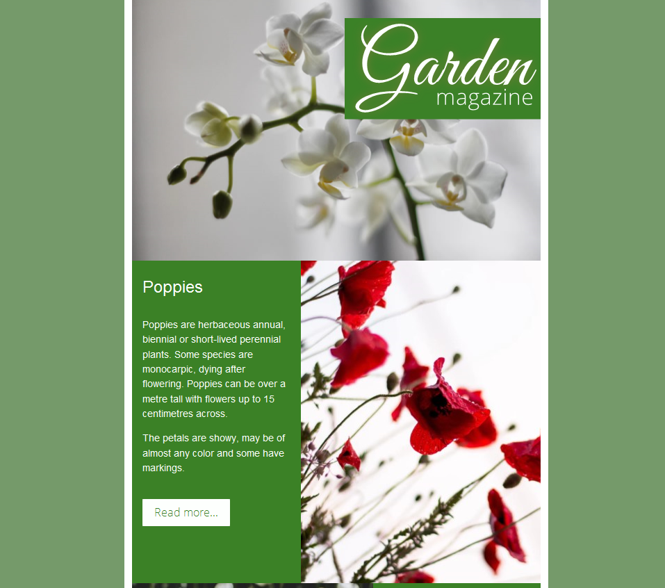
Green
Green is linked to the environment, to water, and to nature in general. It’s also linked to creativity. Brands use it to convey feelings of balance and serenity as well as emphasis. Used with shades of brown in an analogous color scheme, it can communicate a commitment to environmental issues.
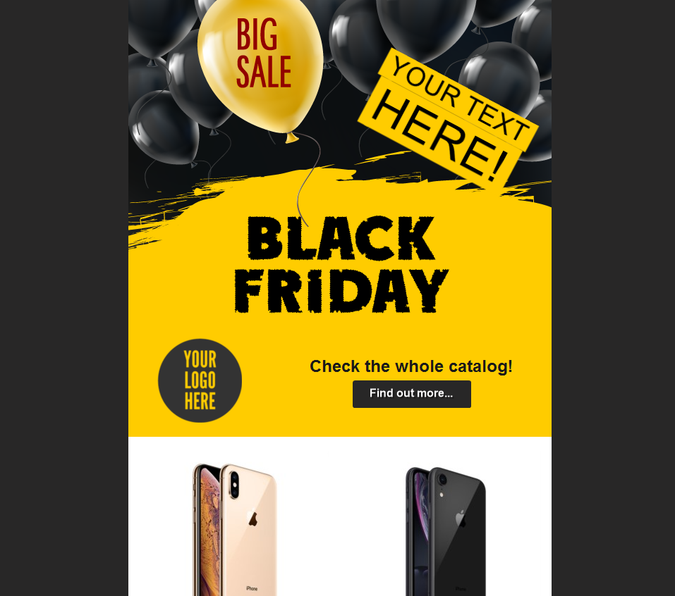
Yellow
Yellow is associated with sunlight. It evokes action, vitality, and optimism, and is often associated with feelings of relief, lightness, and openness.
When paired with very contrasting color palettes, such as black or dark grey, yellow promotes a young, modern and dynamic image.
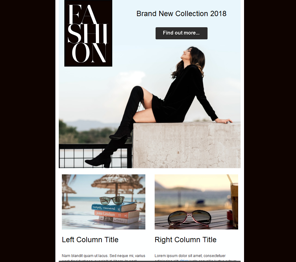
Black
Black is the color of elegance, sobriety, and seriousness. It’s often used by fashion, luxury, and niche brands to give graphic compositions a neutral, minimalist, and very professional tone.
An achromatic (black-white) color scheme can give a newsletter a general look of cleanliness, communicating content distinguished by scrupulousness and reliability.
Red
Red can convey very different sensations and concepts. It’s associated with passion, heat, and energy, but also danger.
In templates, it’s often used to attract the user’s attention but, given the difficult readability of the texts on a red background, it is not recommended for the creation of calls to action. Finally, there are contexts that must use red such as Christmas and Valentine’s Day newsletters.
Tints, tones, and shades created with the addition of white, gray, or black help to strengthen the basic emotions. While red easily evokes intense and passionate sensations, especially in dark shades, pink is associated lightness, open-mindedness, and romance.

Orange
Orange is another color that can convey energy, creativity, and dynamism. It’s often used in calls to action, and works best on dark backgrounds that highlight its contrast and the ability to attract attention.
Color Warning!
Do not fall into the trap of assigning an inner value to colors. The effects described here apply to Western countries where most of your clients are likely to live.
In the Chinese market, however, red means mainly enrichment and fertility, while white is the color of mourning and spirits.
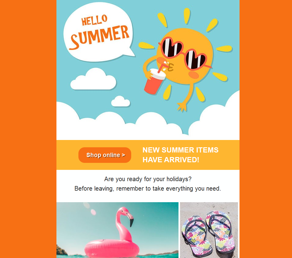
Seasonal emails will also have a strong color connotation. A summer promotional newsletter may contain bright hues of blue, orange, yellow, and green.
In the rainy season, however, brown, blue, gray, and white could be a wise choice, especially if the content of the email concerns seasonal clothing or products.
After reviewing some of the main colors and describing the emotions they generate, The importance of using the right concept-color association to strengthen your message and fix it in the memory of the reader should be clear.